Elder Agency
In 2017, a new owner purchased the Elder Agency, and with it a legacy strong customer relationships and giving back to the community. He wanted to update the outdated logo with a modern symbol that paid homage to the Elder family and upheld the trust that the company had gained from its clients over decades. At first, the new owner wanted to implement elements of outdoor adventure to represent his lifestyle and connection to the local community. But after a few drafts, and dicscussions the logo took a new direction.
Original Logo
The original Elder Agency logo featured a large “E” that the new owner wanted to keep as a central feature of the logo and branding.

First Drafts
My early logo drafts incorporated elements of the Northwoods and adventure to connect with the active outdoor recreation community in Marquette. Ultimately, we decided these designs were too busy and distracted from the sense of integrity and longevity that we wanted the logo to portray.

Design Pivot
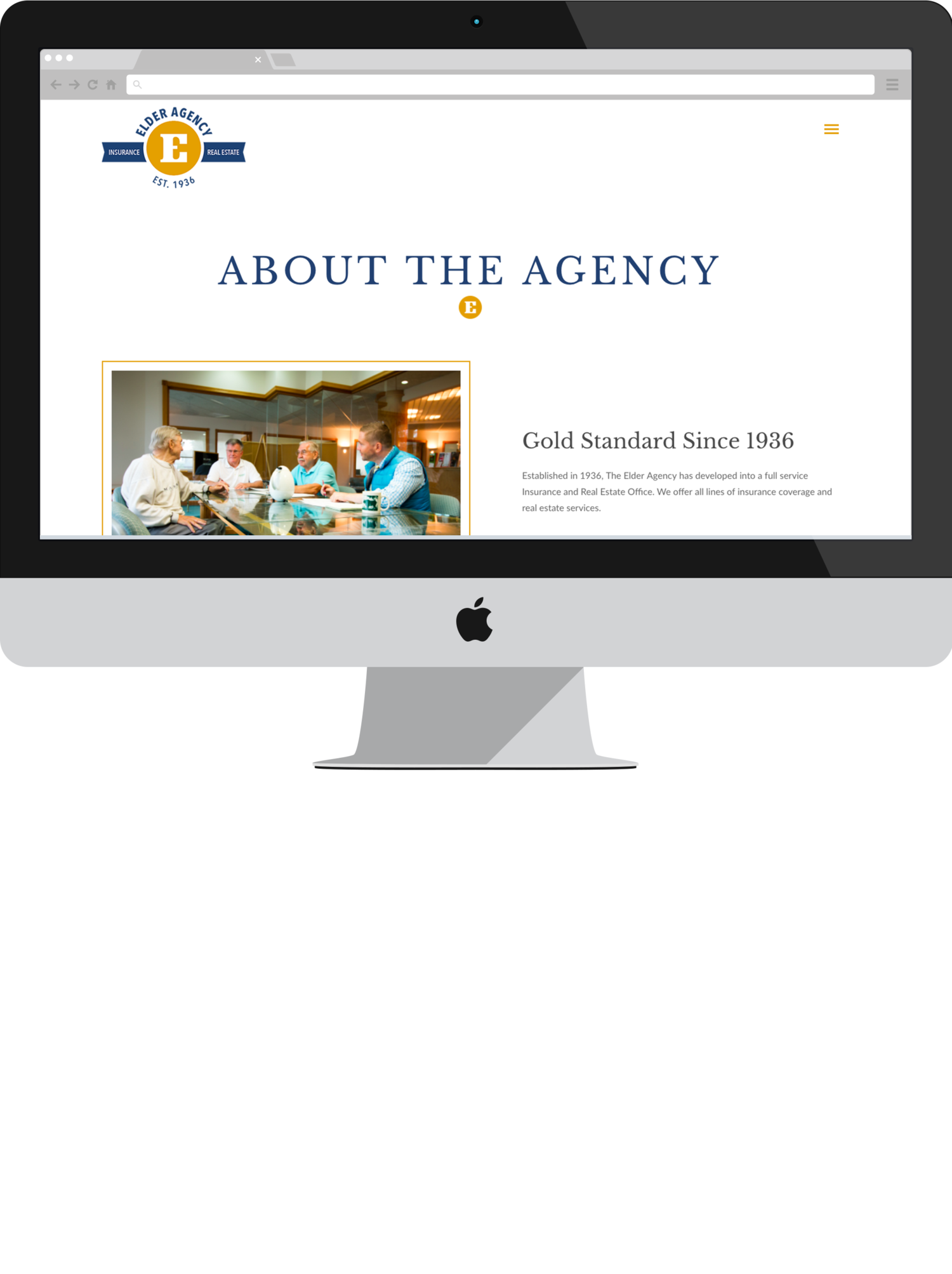
Wanting to bring more stoicism to the Elder Agency brand, I turned a more stripped-down, text-based logo that focused on the details of fine typography. The final logo was solid, simple and proud. A golden “E” at the center represents the gold-standard service that the agency provides for it’s clients, with blue ribbon banners to represent the two branches of the business. This logo easily scales down to a symbol that can be used as a branding tool and design element throughout the website.